import matplotlib.pyplot as pltmatplotlib: a brief introduction
We don’t have time in this course to cover matplotlib at length, but this section will get you started with the library. The website contains the full documentation along with many examples and tutorials.
Input data
At its chore, matplotlib is a library for arrays and it needs NumPy ndarrays or objects that can be converted to them as input (such as Polars and pandas DataFrames).
Plots elements
A matplotlib plot is typically made of several elements, all subclasses of the Artist class:
- a
Figure(the container for the plot), - one or more
Axes(the subplot(s) within your plot), - all the objects contained in each of the Axes:
Axis(ticks and ticks labels),Textobjects,Line2Dobjects (lines in 2D graphs),Polygonobjects,- etc.
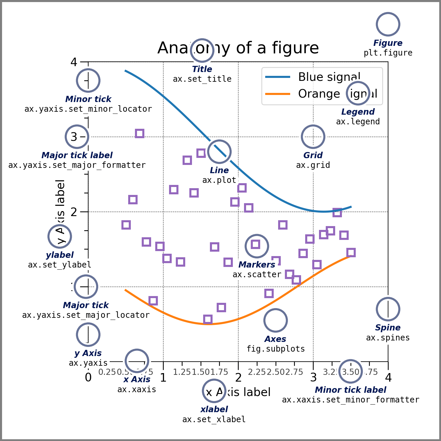
Let’s explore some of these elements.
Figure
The common way to use matplotlib is via the pyplot API:
You can define a Figure with matplotlib.pyplot.figure:
fig = plt.figure()<Figure size 672x480 with 0 Axes>print(fig)Figure(672x480)You can change the dimensions of a Figure:
fig = plt.figure(figsize=(9, 7))<Figure size 864x672 with 0 Axes>Figure and Axes
Single Axes
You can create a Figure as we saw above, then add Axes with matplotlib.figure.Figure.subplots:
fig = plt.figure()
ax = fig.subplots()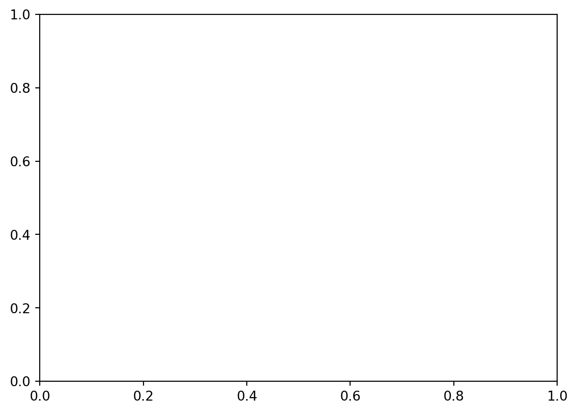
In Jupyter notebooks, matplotlib plots are displayed automatically as soon as they have Axes. Outside of Jupyter, you display the plot with matplotlib.pyplot.show (which means that here, you would run plt.show()).
If you don’t pass any argument to subplots, this creates a single Axes.
matplotlib.pyplot.subplots provides a convenient way to create a Figure and the Axes at the same time:
fig, ax = plt.subplots()
print(type(fig))
print(type(ax))
<class 'matplotlib.figure.Figure'>
<class 'matplotlib.axes._axes.Axes'>Multiple Axes
If you pass values to the arguments nrows and ncols of the subplots function (their defaults are 1), this creates an array of Axes and thus multiple subplots in the plot:
fig, axs = plt.subplots(2, 3)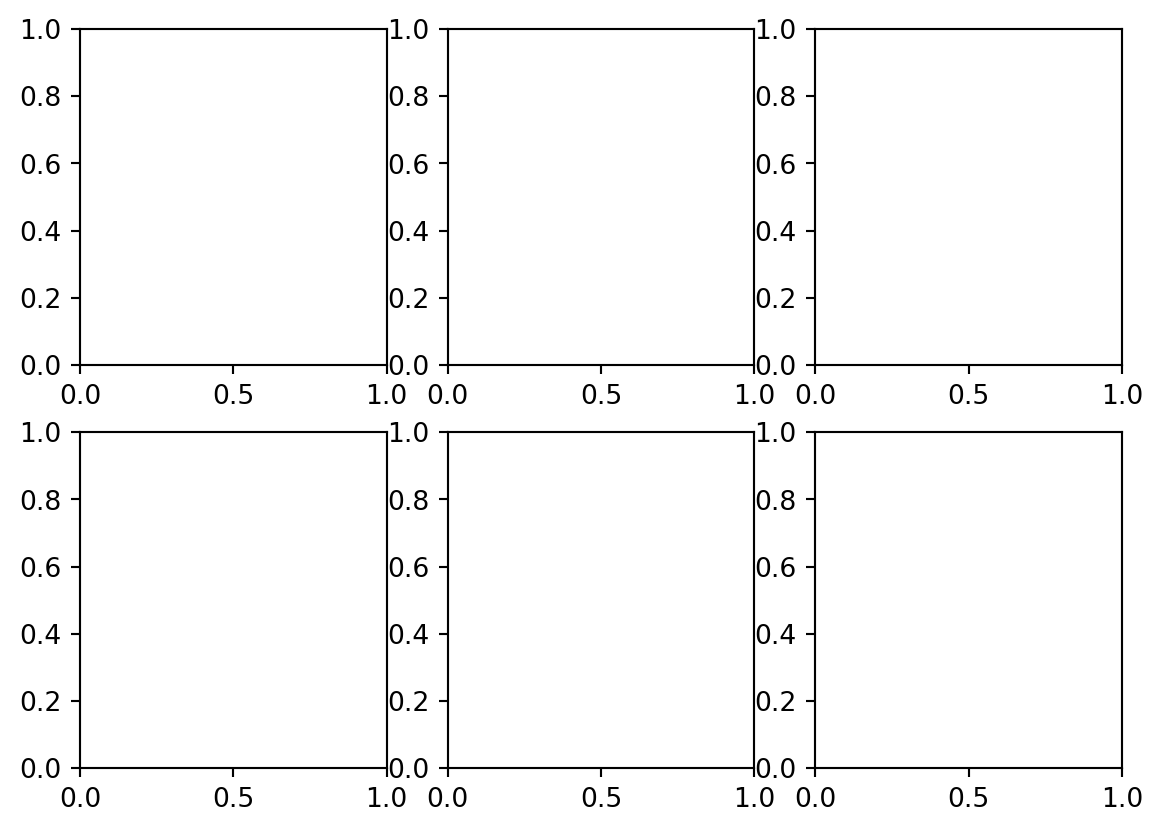
The default is a little squished. We can fix that by increasing the size of the Figure:
fig, axs = plt.subplots(2, 3, figsize=(9, 7))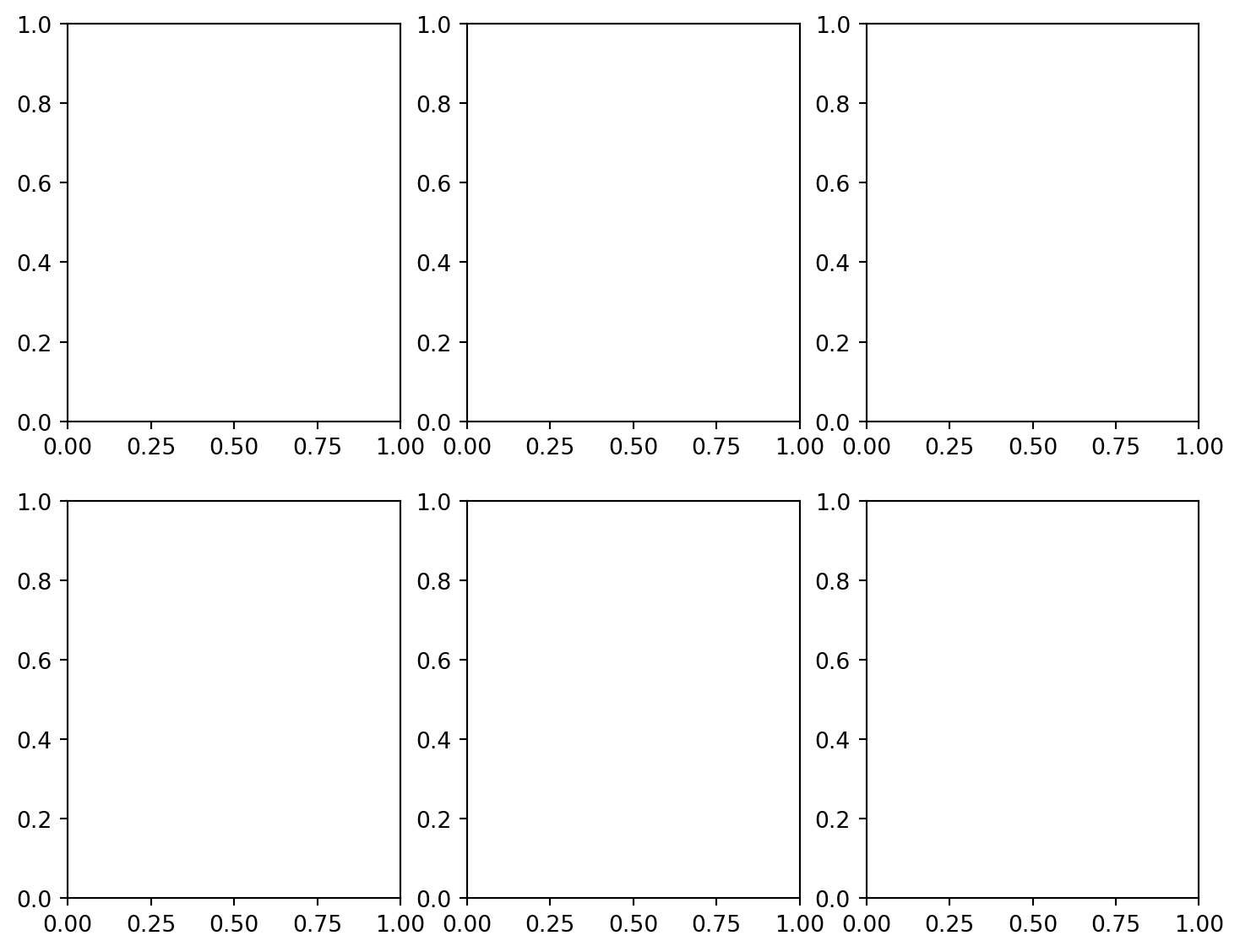
print(type(fig))
print(type(axs))
print(axs.shape)
print(axs)
print(type(axs[0][0]))
<class 'matplotlib.figure.Figure'>
<class 'numpy.ndarray'>
(2, 3)
[[<Axes: > <Axes: > <Axes: >]
[<Axes: > <Axes: > <Axes: >]]
<class 'matplotlib.axes._axes.Axes'>matplotlib.pyplot.subplot_mosaic allows to customize the location of the various Axes thanks to nested lists:
fig, axs = plt.subplot_mosaic([['A', 'B'],
                               ['A', 'C']], figsize=(9, 7))
fig, axs = plt.subplot_mosaic([['A', 'A', 'B'],
                               ['C', '.', 'B']], figsize=(9, 7))
fig, axs = plt.subplot_mosaic([['A', 'B'],
                               ['A', 'B']], figsize=(9, 7))
Adding data
Single Axes
Let’s make up some array data:
import numpy as np

x = np.linspace(0, 10, 100)
y = 4 + 1 * np.sin(2 * x)
Now, let’s plot a Figure with a single Axes and our data:
fig, ax = plt.subplots()
ax.plot(x, y)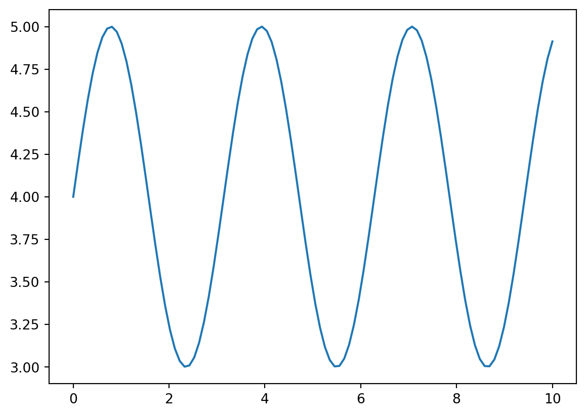
The matplotlib.axes.Axes.plot function plots the 2nd argument (y here) as the dependent variable and the 1st argument (x here) as the independent variable as lines and/or markers using an object of the class matplotlib.lines.Line2D.
If we don’t want to print the address in memory of our Line2D, we can add a semi-colon after the plot function:
fig, ax = plt.subplots()
ax.plot(x, y);
You can customize the line and/or add makers by passing arguments to the plot function.
# Customize line:
fig, ax = plt.subplots()
ax.plot(x, y, linewidth=4, color='g', linestyle=':');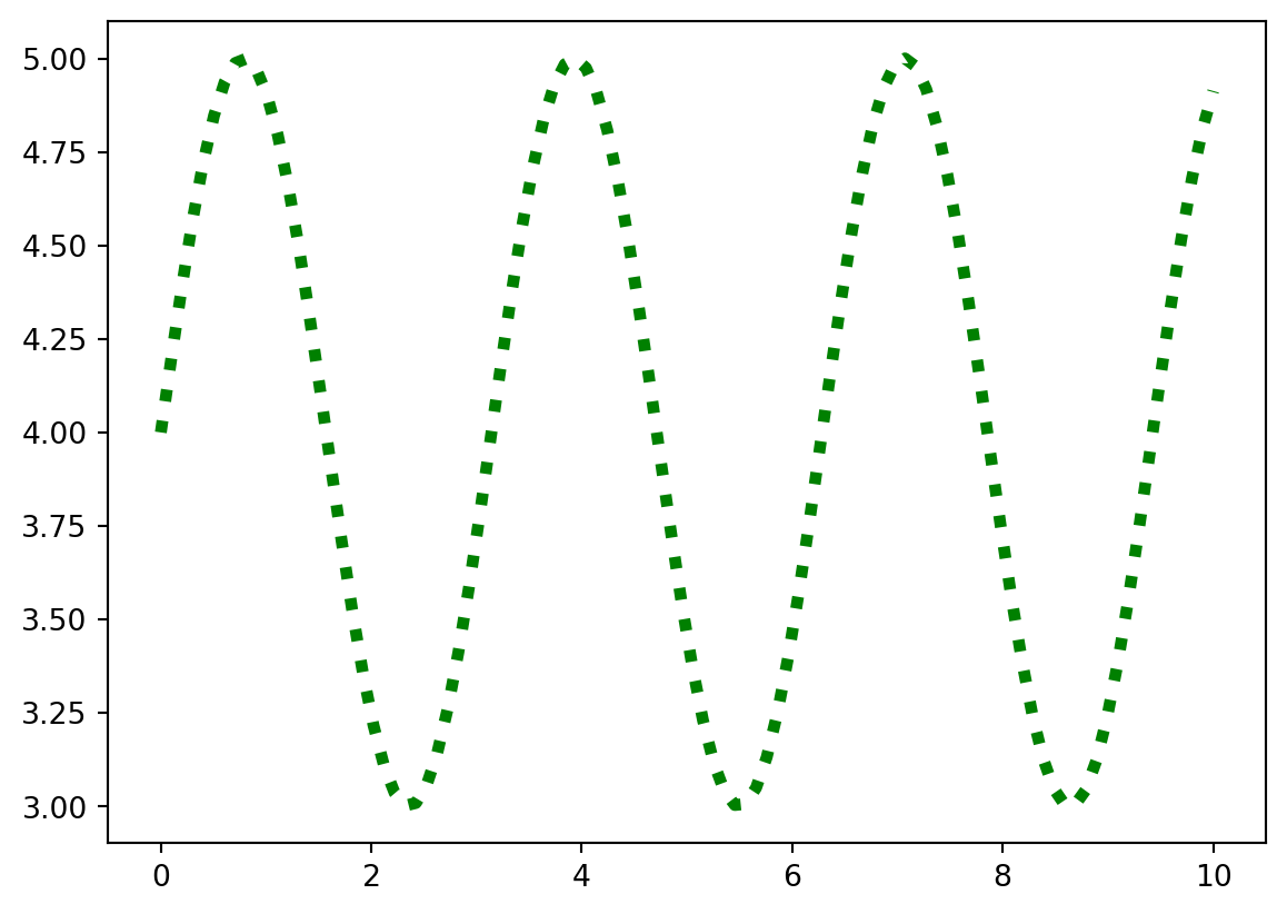
# Add markers:
fig, ax = plt.subplots()
ax.plot(x, y, marker='*');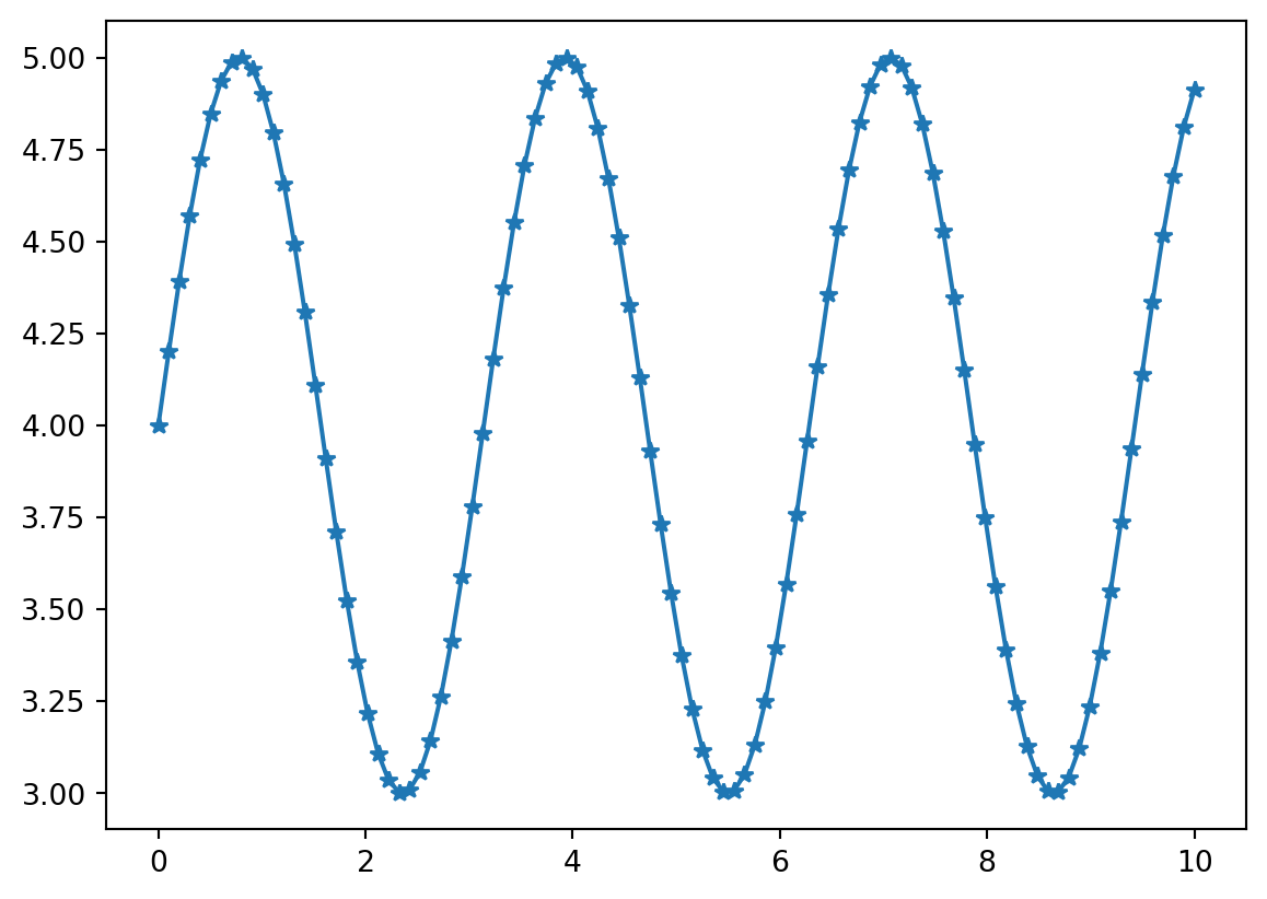
You can add more data to the plot:
y2 = np.cos(x)

fig, ax = plt.subplots()
ax.plot(x, y)
ax.plot(x, y2);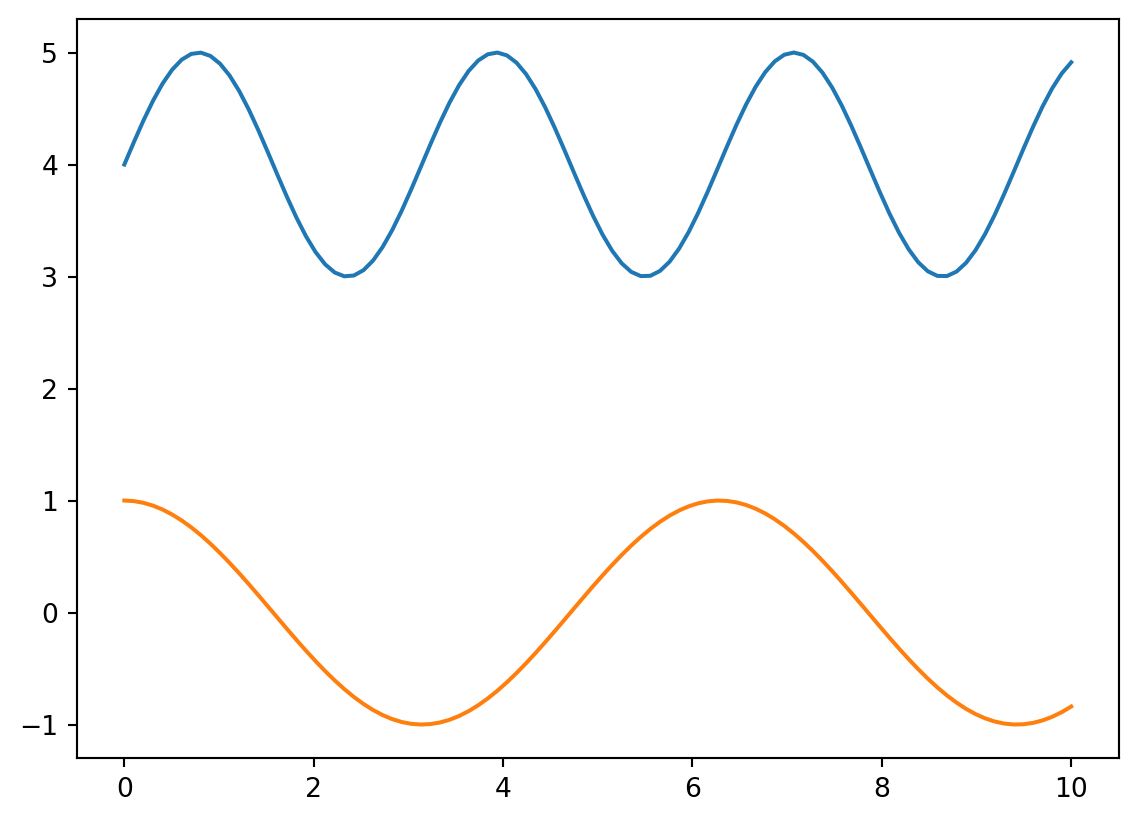
We can add a legend, title, and axes labels:
fig, ax = plt.subplots()
ax.plot(x, y, label='Data 1')
ax.plot(x, y2, label='Data 2')
ax.legend()
ax.set_xlabel('x')
ax.set_ylabel('y')
ax.set_title('Example plot');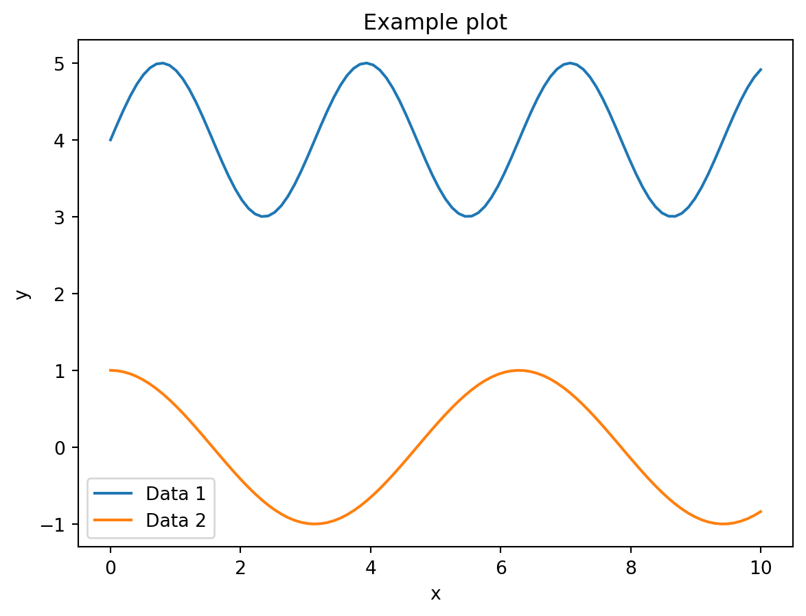
Multiple Axes
We also of course add data to a plot with multiple Axes:
fig, axs = plt.subplots(1, 2, figsize=(9, 7))
axs[0].plot(x, y)
axs[1].plot(x, y2);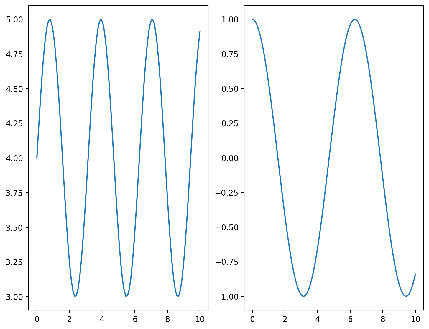
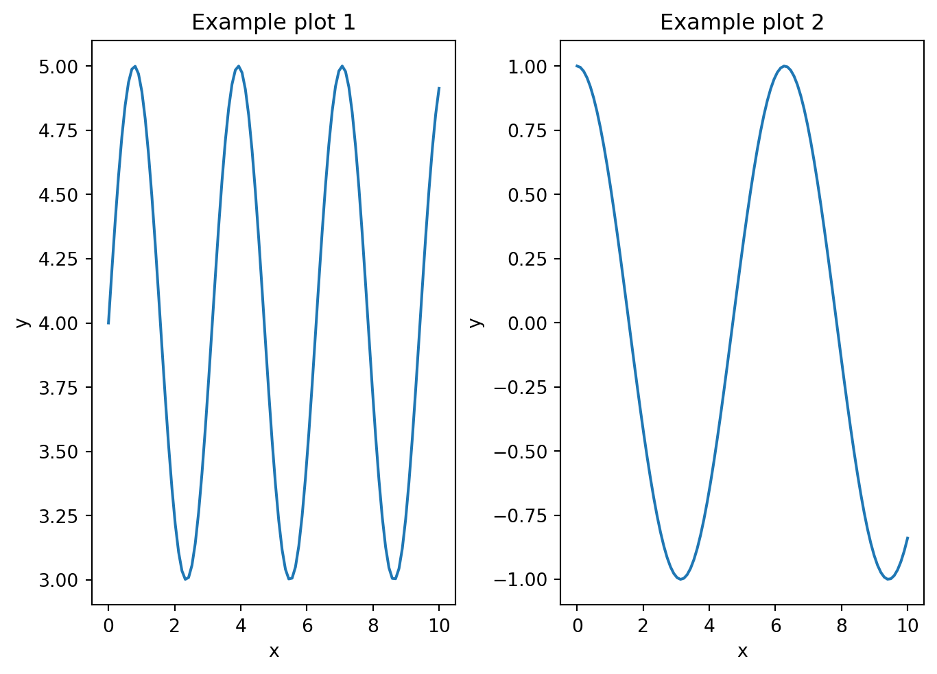
Your turn:
Add axes labels and a title for each of the subplot to get something similar to the figure below:
Your turn:
How would you improve the code for this image displayed in a JAX tutorial?
Complex plots
Now that you understand the fundamentals of matplotlib functioning, you can visit the gallery, look for plots that match your needs and adapt the code.
Here is an example from the gallery:
import matplotlib.pyplot as plt
import numpy as np


def lorenz(xyz, *, s=10, r=28, b=2.667):
    """
    Parameters
    ----------
    xyz : array-like, shape (3,)
       Point of interest in three-dimensional space.
    s, r, b : float
       Parameters defining the Lorenz attractor.

    Returns
    -------
    xyz_dot : array, shape (3,)
       Values of the Lorenz attractor's partial derivatives at *xyz*.
    """
    x, y, z = xyz
    x_dot = s*(y - x)
    y_dot = r*x - y - x*z
    z_dot = x*y - b*z
    return np.array([x_dot, y_dot, z_dot])


dt = 0.01
num_steps = 10000

xyzs = np.empty((num_steps + 1, 3))  # Need one more for the initial values
xyzs[0] = (0., 1., 1.05)  # Set initial values
# Step through "time", calculating the partial derivatives at the current point
# and using them to estimate the next point
for i in range(num_steps):
    xyzs[i + 1] = xyzs[i] + lorenz(xyzs[i]) * dt

# Plot
ax = plt.figure().add_subplot(projection='3d')

ax.plot(*xyzs.T, lw=0.5)
ax.set_xlabel("X Axis")
ax.set_ylabel("Y Axis")
ax.set_zlabel("Z Axis")
ax.set_title("Lorenz Attractor");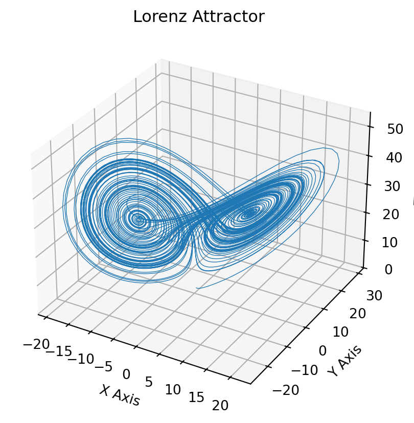
Saving plots
You can save a plot with matplotlib.figure.Figure.savefig:
fig.savefig('our_graph.png')You can set the size, dpi, file type, etc. of the saved file by passing options to the savefig function.
Plots can be saved in .png, .pdf, .svg, .jpg, .tif, .gif, .raw, among others.
A note on syntax
There are many ways to do anything in matplotlib and you will come across various syntaxes linked with the many APIs. This can be very confusing!
In this course, we stick to the native explicit “Axes” interface which is the most customizable and the most standard way to use matplotlib.