a <- 5
c <- c(2, 4, 1)
c * 5
[1] 10 20 5sum(c)[1] 7Content from the workshop slides for easier browsing.
R was created by academic statisticians Ross Ihaka and Robert Gentleman. The name comes from the language S which was a great influence as well as the first initial of the developers.
It was launched in 1993 and has been a GNU Project since 1997.
R is particularly useful in data science fields with heavy statistics, modelling, or Bayesian inference such as biology, linguistics, economics, or statistics.
R being an interpreted language, it can be run non-interactively or interactively.
If you write code in a text file (called a script), you can then execute it with:
Rscript my_script.RThe command to execute scripts is Rscript rather than R.
By convention, R scripts take the extension .R
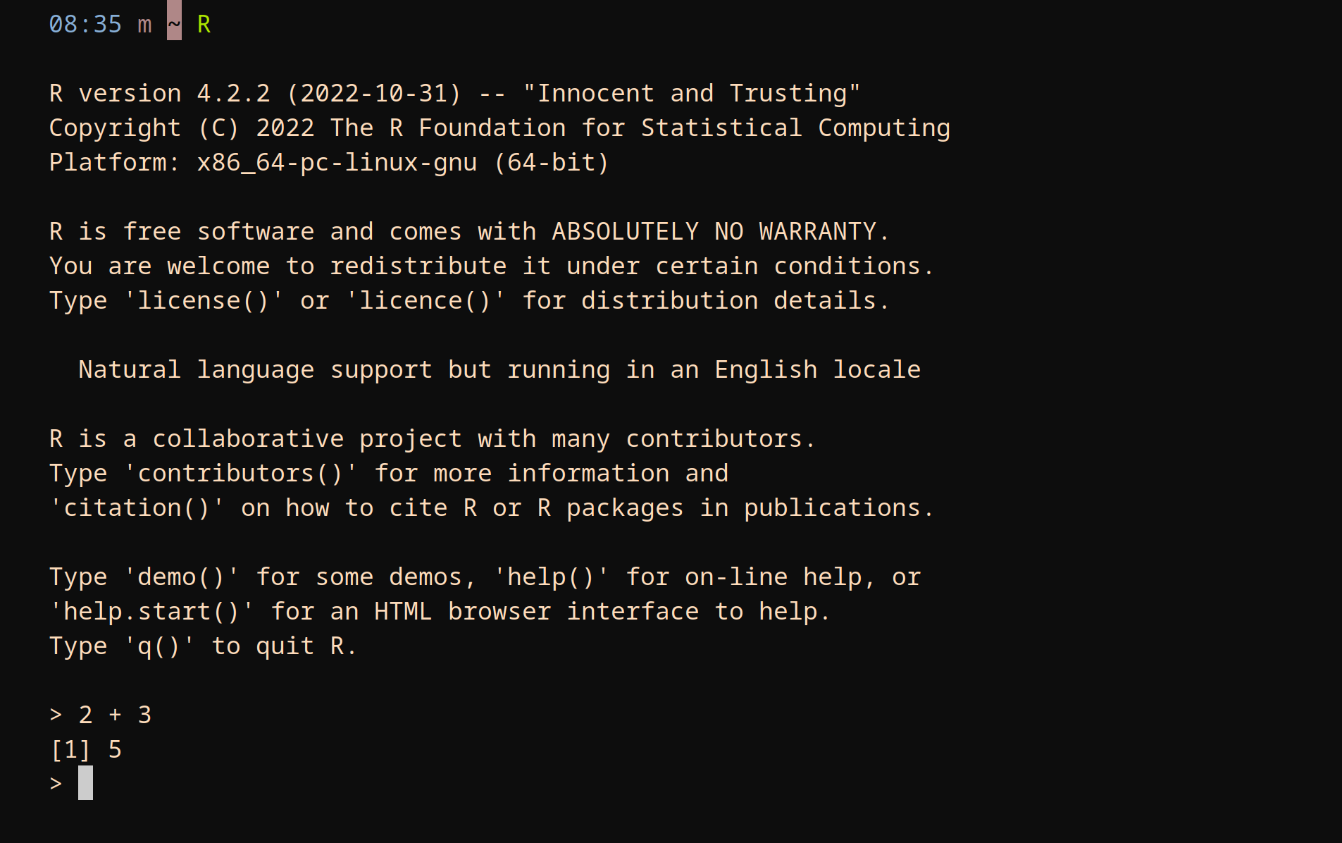
There are several ways to run R interactively:
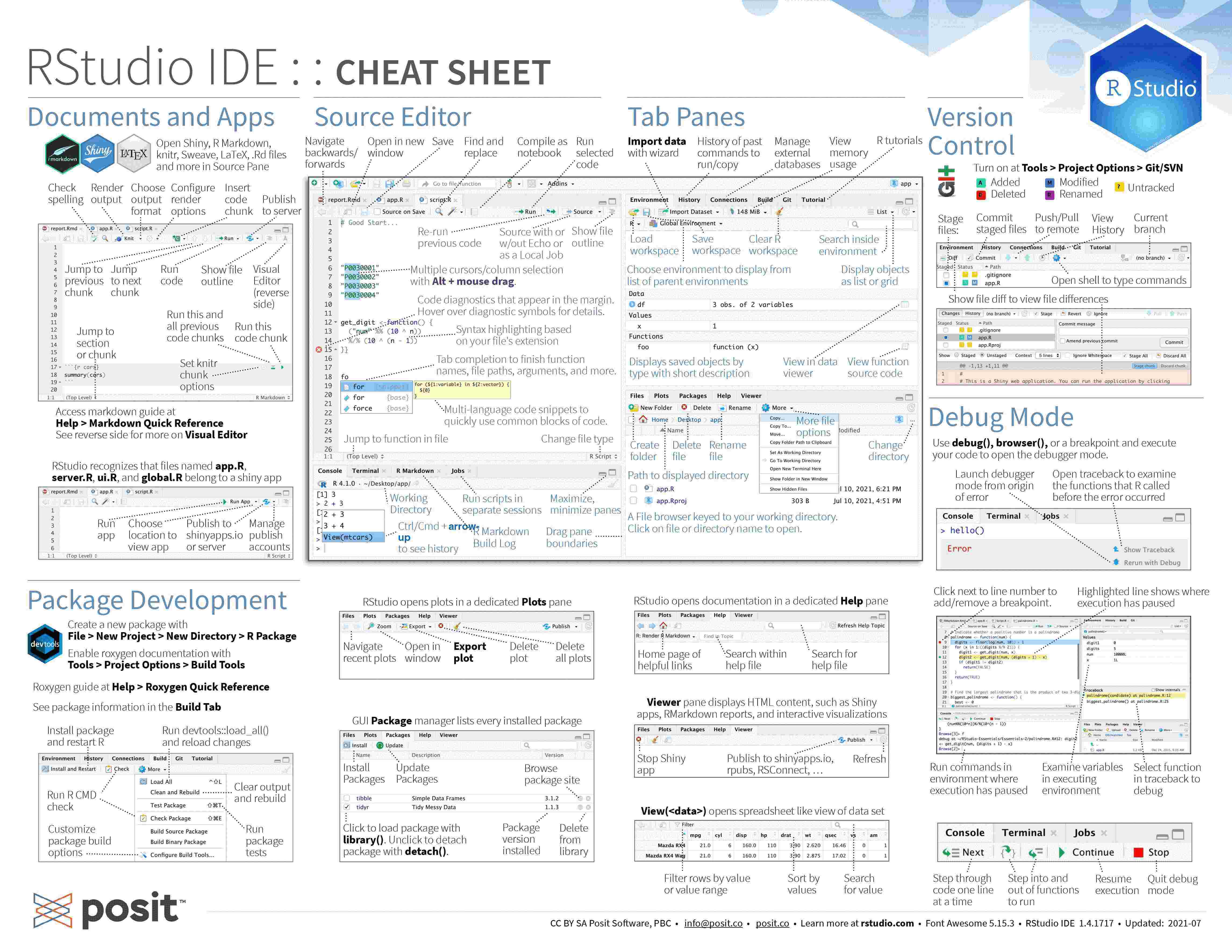
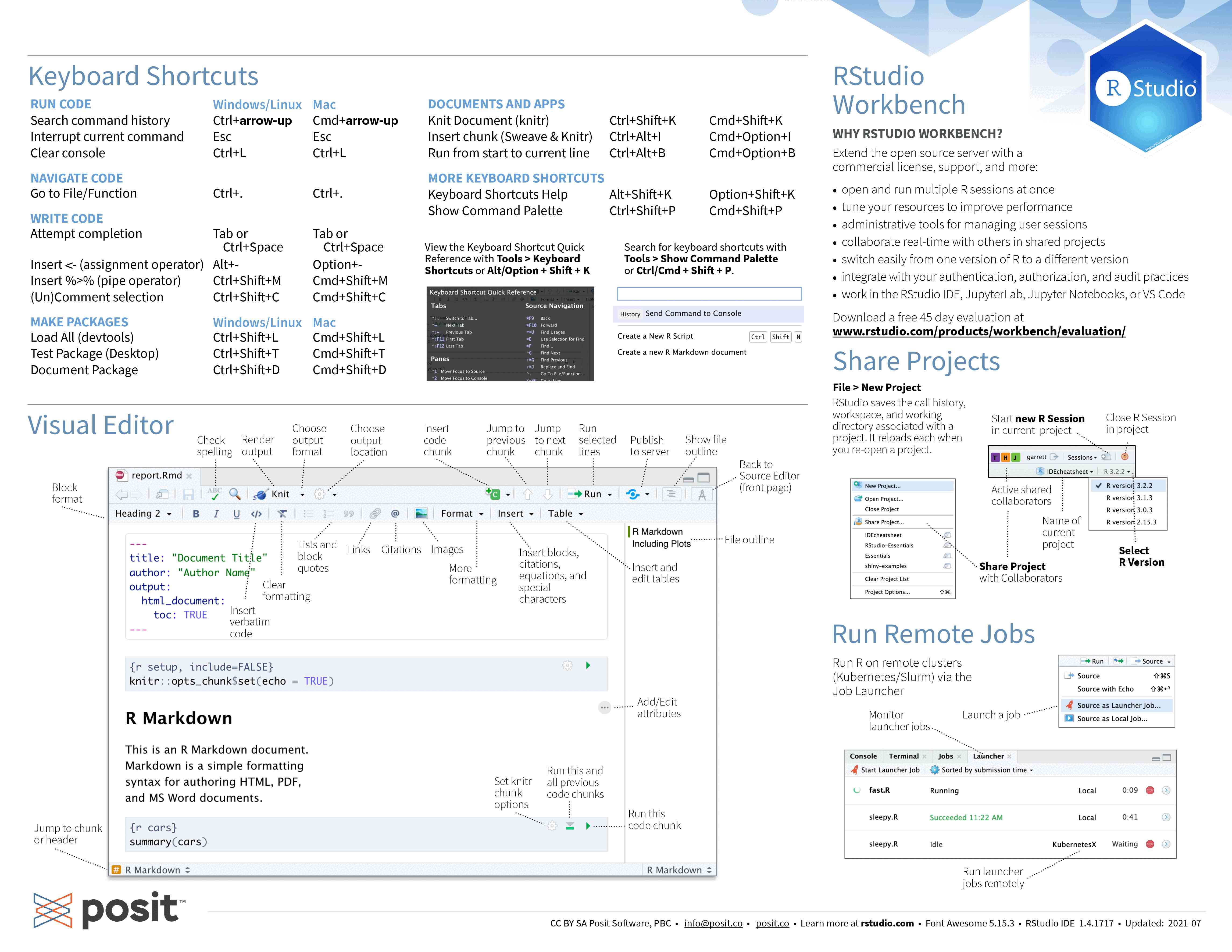
Posit (formerly RStudio Inc.) developed a great and very popular IDE called RStudio. Here is its cheatsheet (click on it to download it):
The R documentation is excellent. Get info on any function with ? (e.g. ?sum).
a <- 5
c <- c(2, 4, 1)
c * 5[1] 10 20 5sum(c)[1] 7R really shines when it comes to statistics and modelling, so we will spend the rest of the hour diving into very complex and heavy Bayesian statistics.
Just kidding 🙂. In this demo, I will stick to fun topics.
We will use the ggplot2 package.
You can find the ggplot2 cheatsheet here.
R comes with a number of datasets. You can get a list by running data(). The ggplot2 package provides additional ones, such as the mpg dataset:
library(ggplot2)
head(mpg, 4)  # we are printing only the first 4 rows
# A tibble: 4 × 11
manufacturer model displ year cyl trans drv cty hwy fl
<chr> <chr> <dbl> <int> <int> <chr> <chr> <int> <int> <chr>
1 audi a4 1.8 1999 4 auto(l5) f 18 29 p
2 audi a4 1.8 1999 4 manual(m5) f 21 29 p
3 audi a4 2 2008 4 manual(m6) f 20 31 p
4 audi a4 2 2008 4 auto(av) f 21 30 p
class
<chr>
1 compact
2 compact
3 compact
4 compactThe font size can be configured. To set the general font size, you can pass a value to base_size in the argument of the theme you are using. The default theme is theme_grey (we will see more about themes later):
theme_set(theme_grey(base_size = 8))The first component is the data:
ggplot(data = mpg)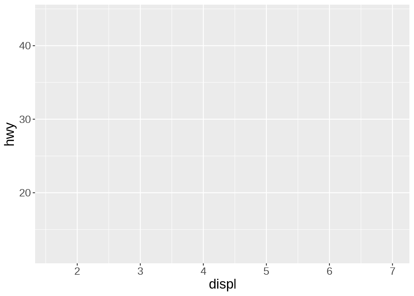
This can be simplified into ggplot(mpg).
The second component sets the way variables are mapped on the axes. This is done with the aes() (aesthetics) function:
ggplot(data = mpg, mapping = aes(x = displ, y = hwy))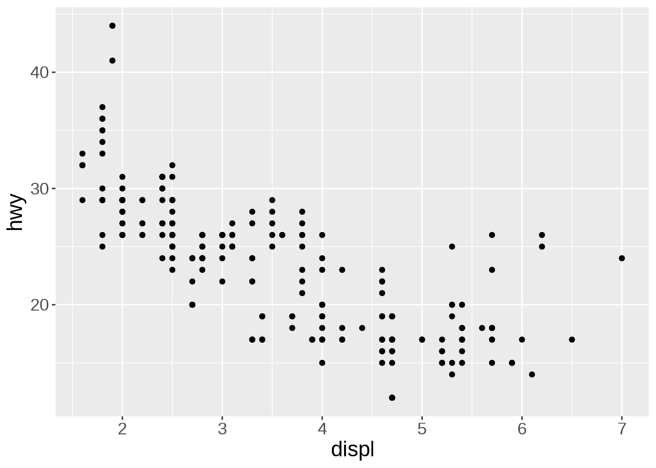
This can be simplified into ggplot(mpg, aes(displ, hwy)).
Onto this canvas, we can add “geoms” (geometrical objects) representing the data. The type of “geom” defines the type of representation (e.g. boxplot, histogram, bar chart).
To represent the data as a scatterplot, we use the geom_point() function:
ggplot(mpg, aes(x = displ, y = hwy)) +
  geom_point()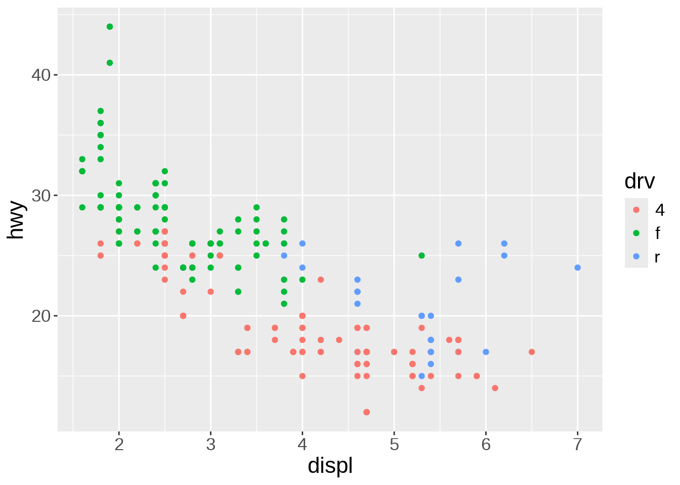
We can colour-code the points in the scatterplot based on the drv variable, showing the lower fuel efficiency of 4WD vehicles:
ggplot(mpg, aes(x = displ, y = hwy)) +
  geom_point(aes(color = drv))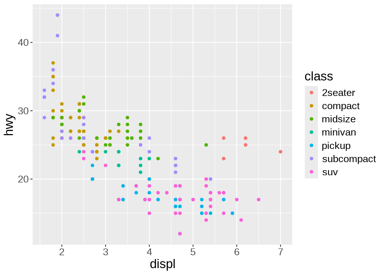
Or we can colour-code them based on the class variable:
ggplot(mpg, aes(x = displ, y = hwy)) +
  geom_point(aes(color = class))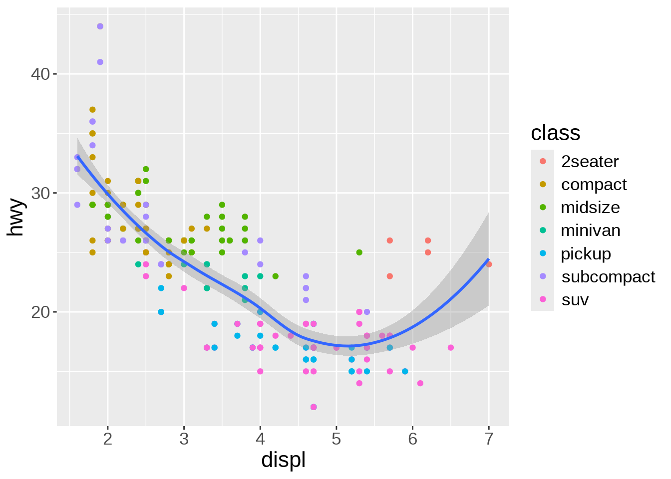
Multiple “geoms” can be added on top of each other. For instance, we can add a smoothed conditional means function that aids at seeing patterns in the data with geom_smooth():
ggplot(mpg, aes(x = displ, y = hwy)) +
  geom_point(aes(color = class)) +
  geom_smooth()
`geom_smooth()` using method = 'loess' and formula = 'y ~ x'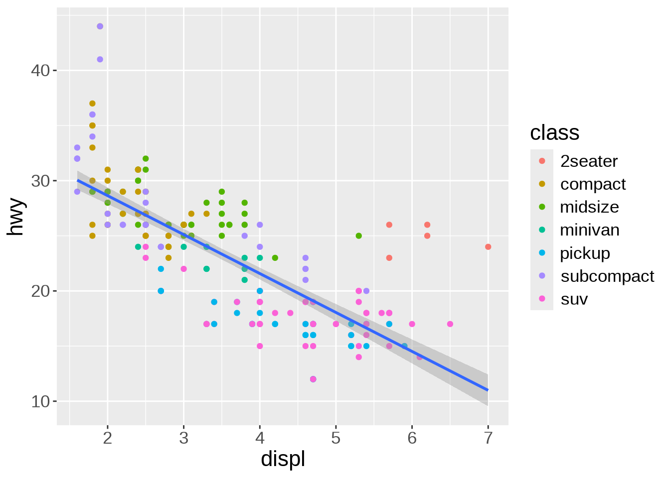
Thanks to the colour-coding of the types of car, we can see that the cluster of points in the top right corner all belong to the same type: 2 seaters. Those are outliers with high power, yet high few efficiency due to their smaller size.
The default smoothing function uses the LOESS (locally estimated scatterplot smoothing) method, which is a nonlinear regression. But maybe a linear model would actually show the general trend better. We can change the method by passing it as an argument to geom_smooth():
ggplot(mpg, aes(x = displ, y = hwy)) +
  geom_point(aes(color = class)) +
  geom_smooth(method = lm)
`geom_smooth()` using formula = 'y ~ x'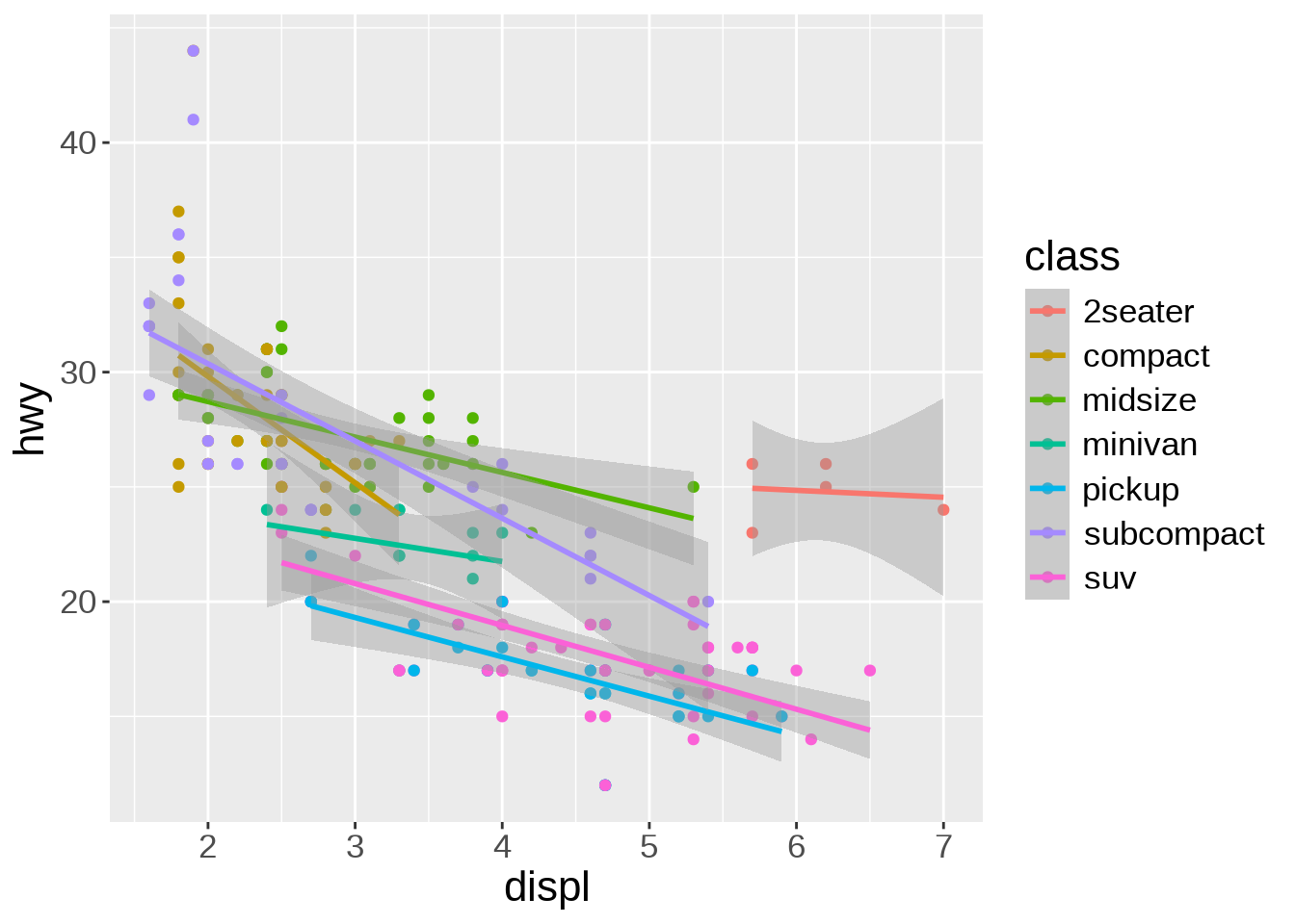
Of course, we could apply the smoothing function to each class instead of the entire data. It creates a busy plot but shows that the downward trend remains true within each type of car:
ggplot(mpg, aes(x = displ, y = hwy, color = class)) +
  geom_point(aes(color = class)) +
  geom_smooth(method = lm)
`geom_smooth()` using formula = 'y ~ x'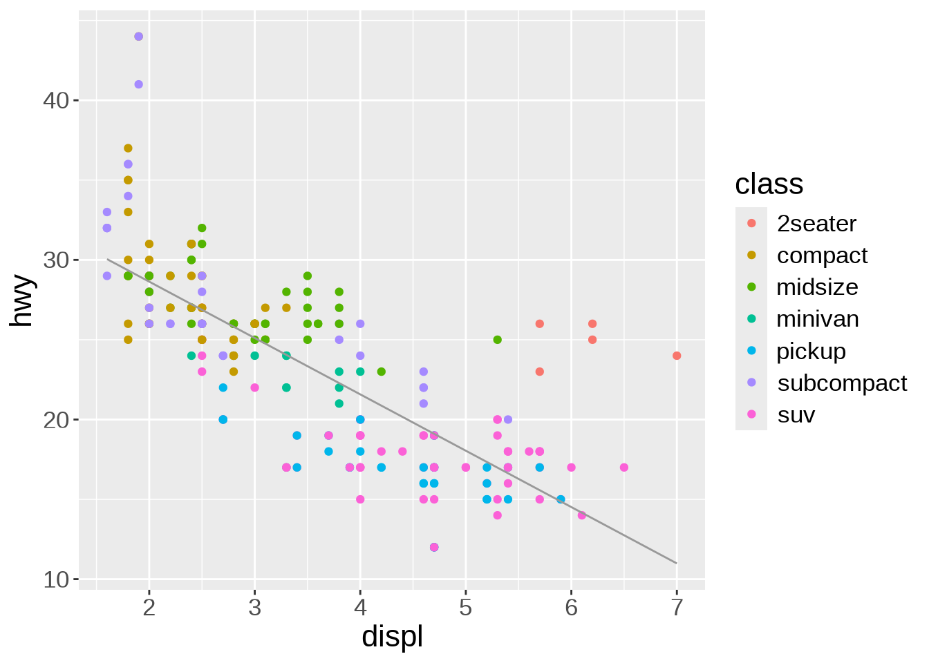
Other arguments to geom_smooth() can set the line width, color, or whether or not the standard error (se) is shown:
ggplot(mpg, aes(x = displ, y = hwy)) +
  geom_point(aes(color = class)) +
  geom_smooth(
    method = lm,
    se = FALSE,
    color = "#999999",
    linewidth = 0.5
  )
`geom_smooth()` using formula = 'y ~ x'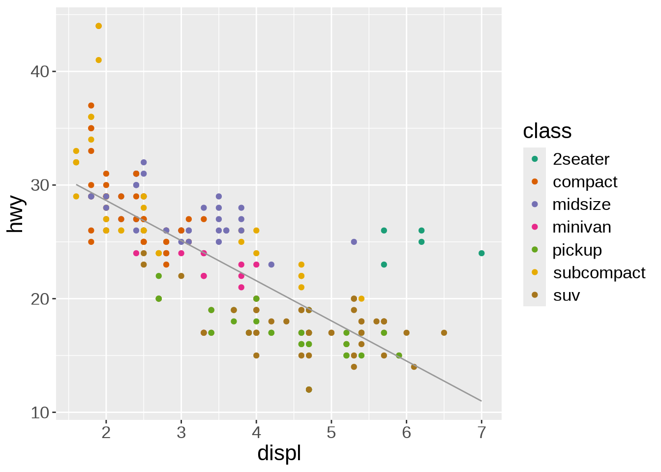
If we want to change the colour scale, we add another layer for this:
ggplot(mpg, aes(x = displ, y = hwy)) +
  geom_point(aes(color = class)) +
  scale_color_brewer(palette = "Dark2") +
  geom_smooth(
    method = lm,
    se = FALSE,
    color = "#999999",
    linewidth = 0.5
  )
`geom_smooth()` using formula = 'y ~ x'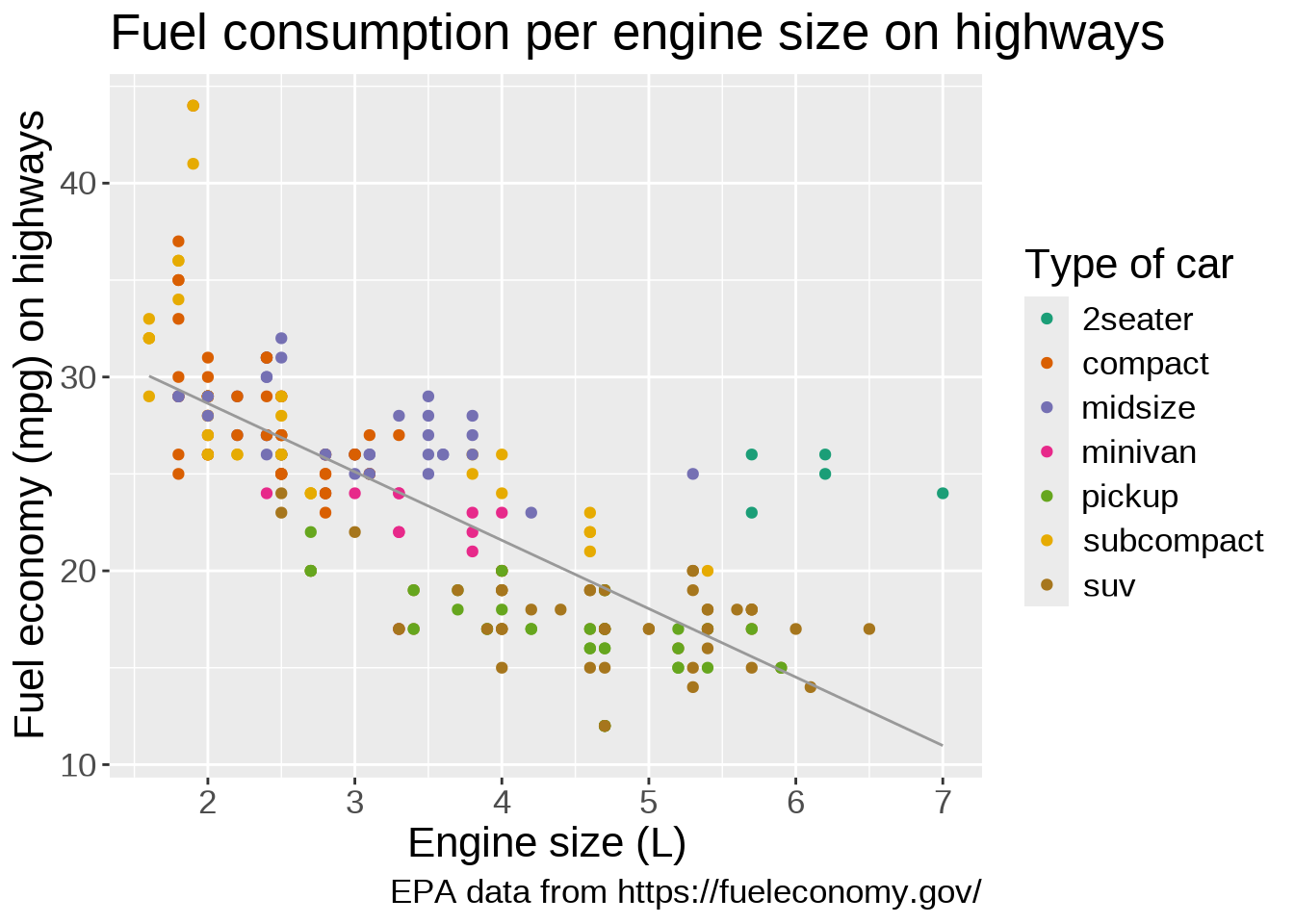
scale_color_brewer(), based on color brewer 2.0, is one of many methods to change the color scale. Here is the list of available scales for this particular method:
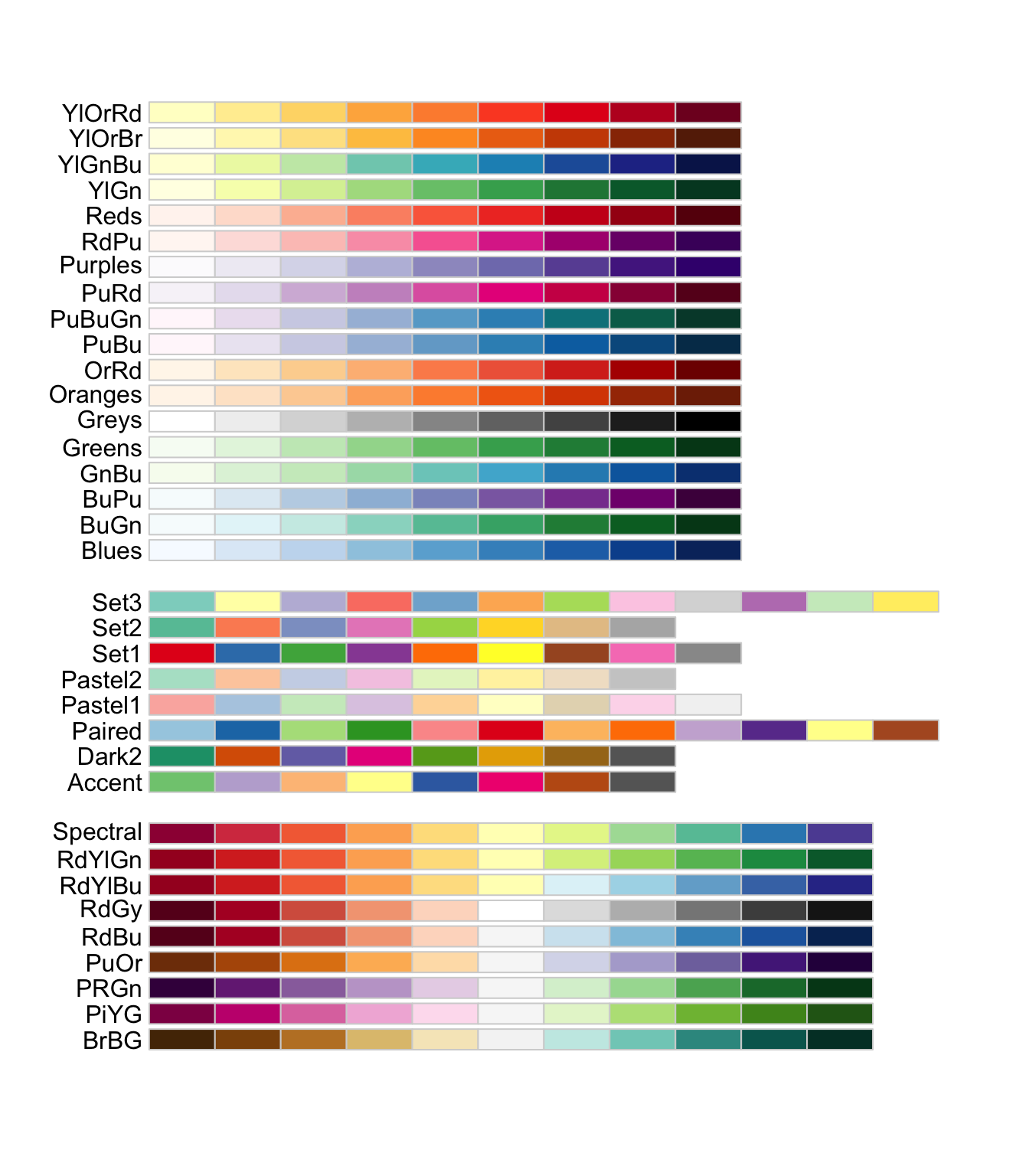
We can keep on adding layers. For instance, the labs() function allows to set title, subtitle, captions, tags, axes labels, etc.
ggplot(mpg, aes(x = displ, y = hwy)) +
  geom_point(aes(color = class)) +
  scale_color_brewer(palette = "Dark2") +
  geom_smooth(
    method = lm,
    se = FALSE,
    color = "#999999",
    linewidth = 0.5
  ) +
  labs(
    title = "Fuel consumption per engine size on highways",
    x = "Engine size (L)",
    y = "Fuel economy (mpg) on highways",
    color = "Type of car",
    caption = "EPA data from https://fueleconomy.gov/"
  )
`geom_smooth()` using formula = 'y ~ x'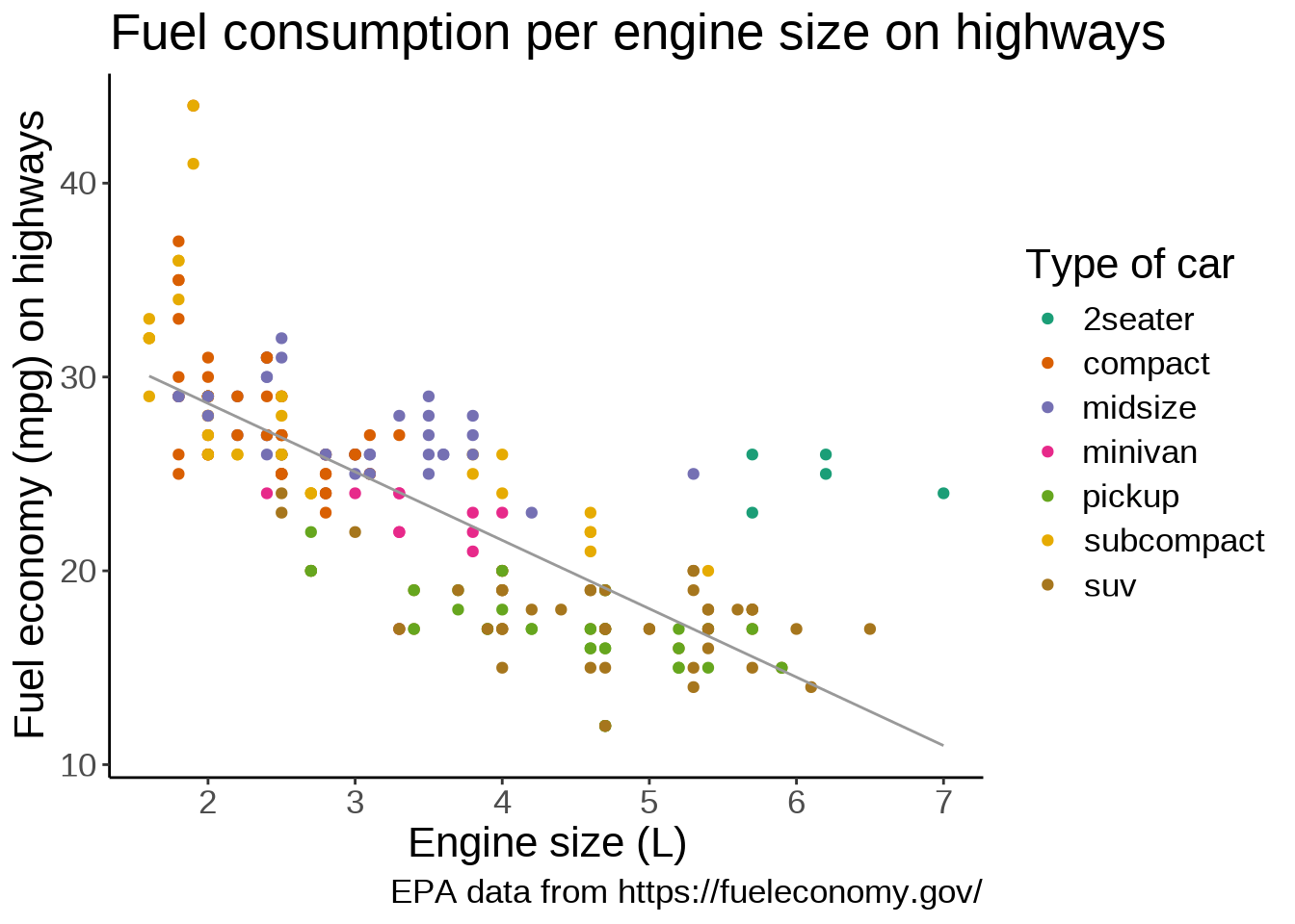
Another optional layer sets one of several preset themes.
Edward Tufte developed, amongst others, the principle of data-ink ratio which emphasizes that ink should be used primarily where it communicates meaningful messages. It is indeed common to see charts where more ink is used in labels or background than in the actual representation of the data.
The default ggplot2 theme could be criticized as not following this principle. Let’s change it:
ggplot(mpg, aes(x = displ, y = hwy)) +
  geom_point(aes(color = class)) +
  scale_color_brewer(palette = "Dark2") +
  geom_smooth(
    method = lm,
    se = FALSE,
    color = "#999999",
    linewidth = 0.5
  ) +
  labs(
    title = "Fuel consumption per engine size on highways",
    x = "Engine size (L)",
    y = "Fuel economy (mpg) on highways",
    color = "Type of car",
    caption = "EPA data from https://fueleconomy.gov/"
  ) +
  theme_classic(base_size = 8)
`geom_smooth()` using formula = 'y ~ x'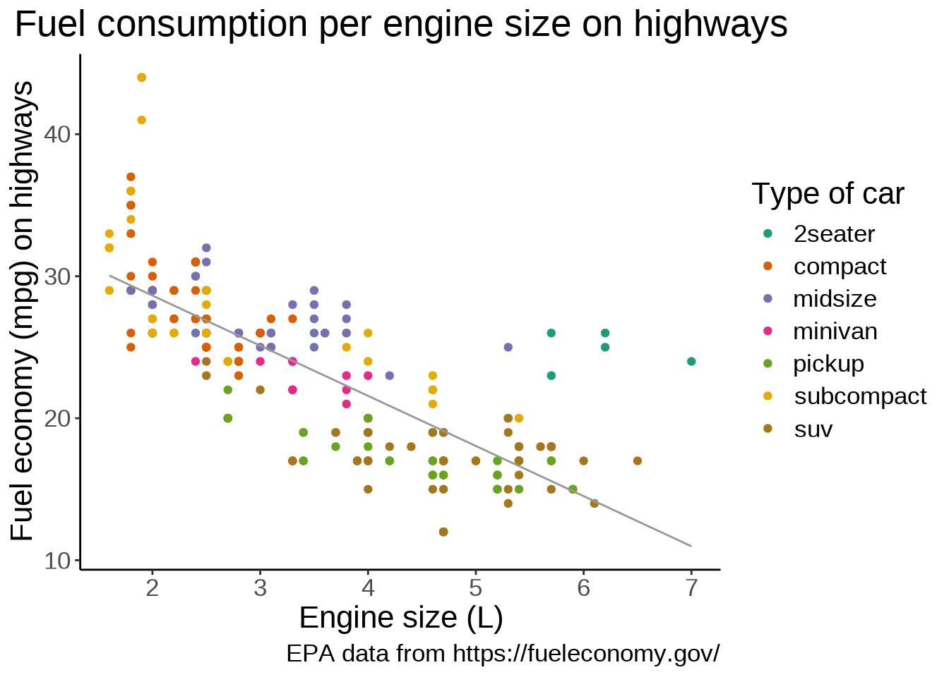
The theme() function allows to tweak the theme in any number of ways. For instance, what if we don’t like the default position of the title and we would rather have it centered?
ggplot(mpg, aes(x = displ, y = hwy)) +
  geom_point(aes(color = class)) +
  scale_color_brewer(palette = "Dark2") +
  geom_smooth(
    method = lm,
    se = FALSE,
    color = "#999999",
    linewidth = 0.5
  ) +
  labs(
    title = "Fuel consumption per engine size on highways",
    x = "Engine size (L)",
    y = "Fuel economy (mpg) on highways",
    color = "Type of car",
    caption = "EPA data from https://fueleconomy.gov/"
  ) +
  theme_classic(base_size = 8) +
  theme(plot.title = element_text(hjust = 0.5))
`geom_smooth()` using formula = 'y ~ x'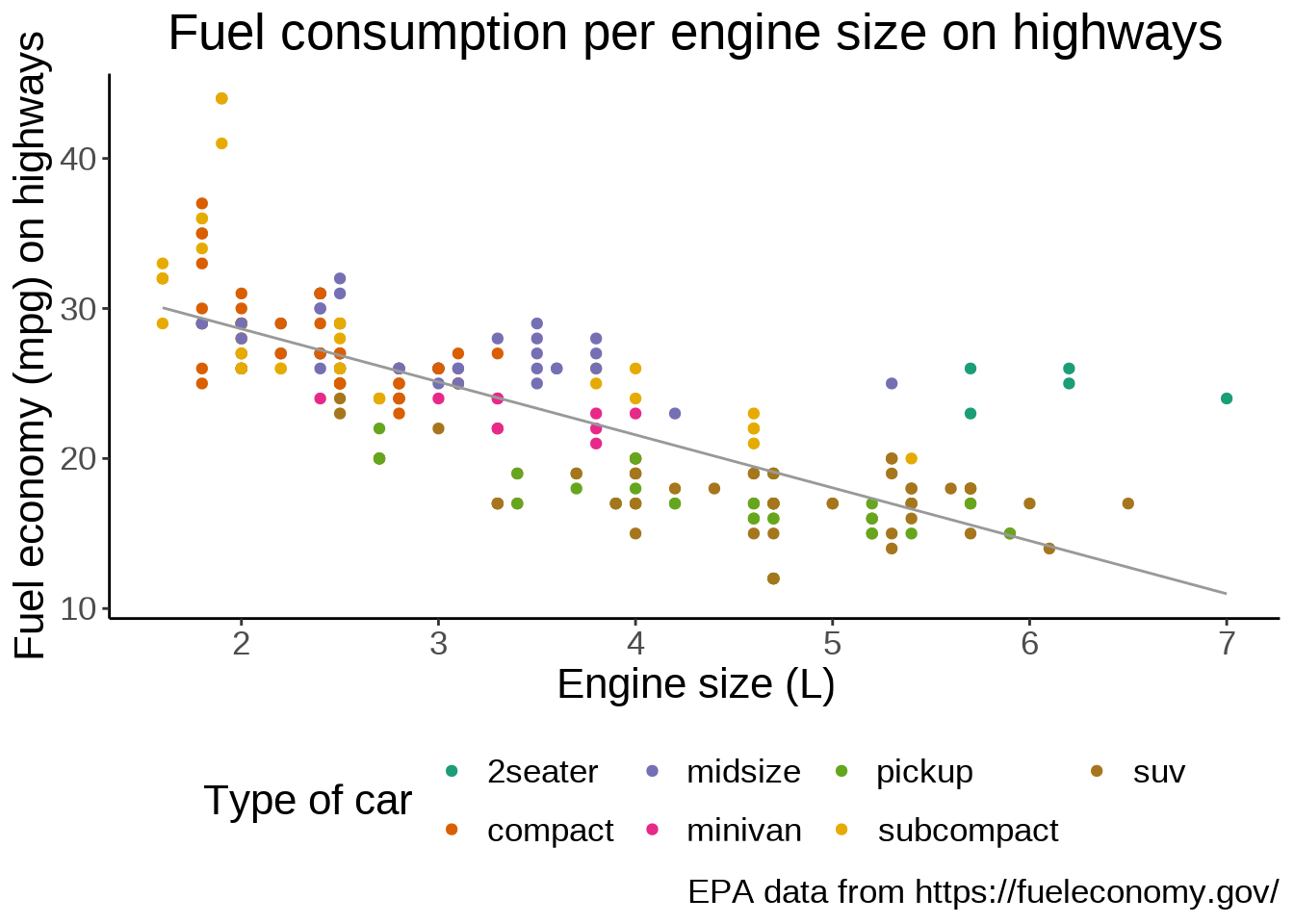
We can also move the legend to give more space to the actual graph:
ggplot(mpg, aes(x = displ, y = hwy)) +
  geom_point(aes(color = class)) +
  scale_color_brewer(palette = "Dark2") +
  geom_smooth(
    method = lm,
    se = FALSE,
    color = "#999999",
    linewidth = 0.5
  ) +
  labs(
    title = "Fuel consumption per engine size on highways",
    x = "Engine size (L)",
    y = "Fuel economy (mpg) on highways",
    color = "Type of car",
    caption = "EPA data from https://fueleconomy.gov/"
  ) +
  theme_classic(base_size = 8) +
  theme(plot.title = element_text(hjust = 0.5), legend.position = "bottom")
`geom_smooth()` using formula = 'y ~ x'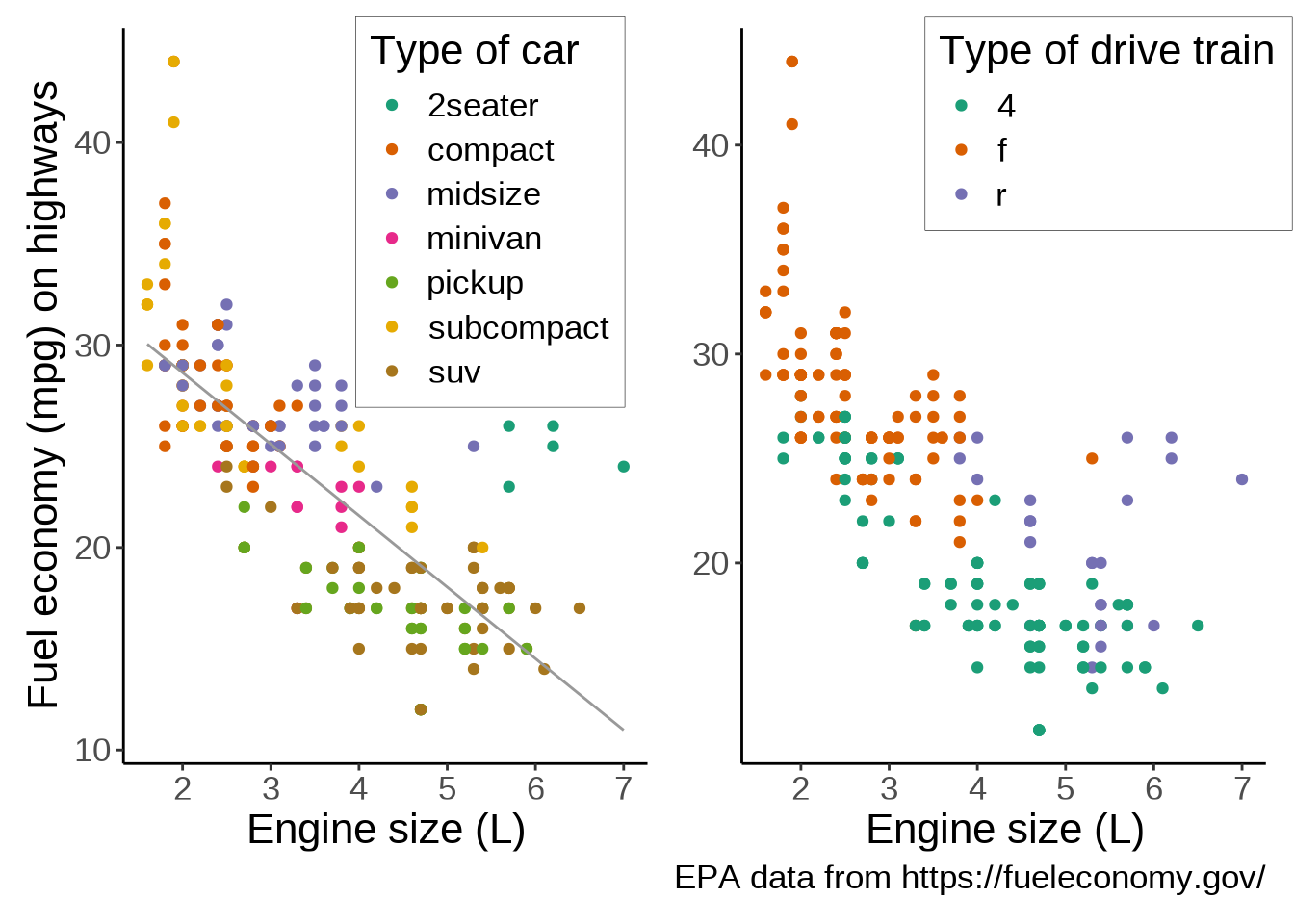
As you could see, ggplot2 works by adding a number of layers on top of each other, all following a standard set of rules, or “grammar”. This way, a vast array of graphs can be created by organizing simple components.
Thanks to its vast popularity, ggplot2 has seen a proliferation of packages extending its capabilities.
For instance the patchwork package allows to easily combine multiple plots on the same frame.
Let’s add a second plot next to our plot. To add plots side by side, we simply add them to each other. We also make a few changes to the labels to improve the plots integration:
library(patchwork)

ggplot(mpg, aes(x = displ, y = hwy)) +        # First plot
  geom_point(aes(color = class)) +
  scale_color_brewer(palette = "Dark2") +
  geom_smooth(
    method = lm,
    se = FALSE,
    color = "#999999",
    linewidth = 0.5
  ) +
  labs(
    x = "Engine size (L)",
    y = "Fuel economy (mpg) on highways",
    color = "Type of car"
  ) +
  theme_classic(base_size = 8) +
  theme(
    plot.title = element_text(hjust = 0.5),
    legend.position.inside = c(0.7, 0.75),           # Better legend position
    legend.background = element_rect(         # Add a frame to the legend
      linewidth = 0.1,
      linetype = "solid",
      colour = "black"
    )
  ) +
  ggplot(mpg, aes(x = displ, y = hwy)) +      # Second plot
  geom_point(aes(color = drv)) +
  scale_color_brewer(palette = "Dark2") +
  labs(
    x = "Engine size (L)",
    y = element_blank(),                      # Remove redundant label
    color = "Type of drive train",
    caption = "EPA data from https://fueleconomy.gov/"
  ) +
  theme_classic(base_size = 8) +
  theme(
    plot.title = element_text(hjust = 0.5),
    legend.position.inside = c(0.7, 0.87),
    legend.background = element_rect(
      linewidth = 0.1,
      linetype = "solid",
      colour = "black"
    )
  )
`geom_smooth()` using formula = 'y ~ x'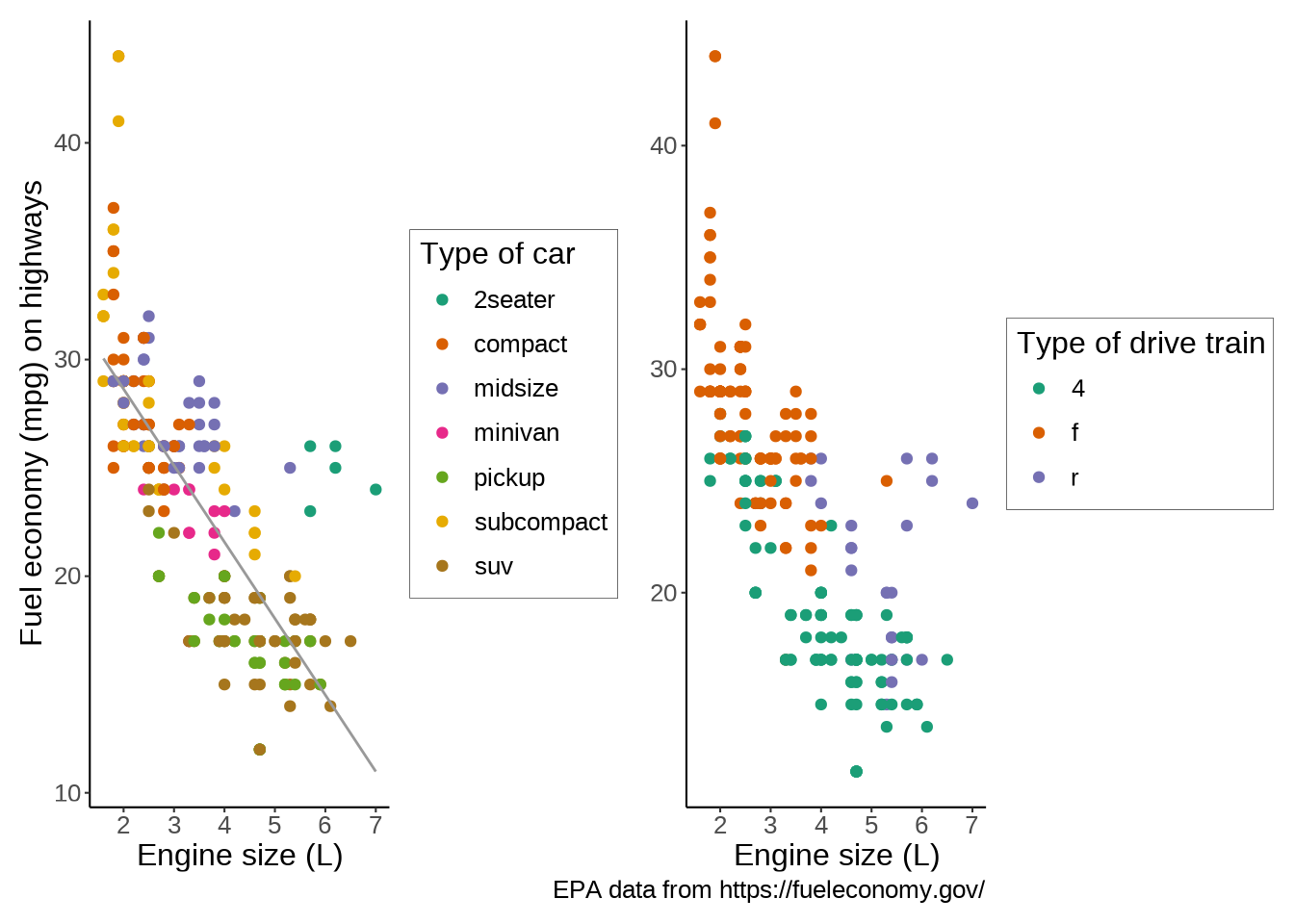
Another popular extension is the gganimate package which allows to create data animations.
A full list of extensions for ggplot2 is shown below (here is the website):
HyperText Markup Language (HTML) is the standard markup language for websites: it encodes the information related to the formatting and structure of webpages. Additionally, some of the customization can be stored in Cascading Style Sheets (CSS) files.
HTML uses tags of the form:
<some_tag>Your content</some_tag>Some tags have attributes:
<some_tag attribute_name="attribute value">Your content</some_tag>Examples:
<h2>This is a heading of level 2</h2><b>This is bold</b><a href="https://some.url">This is the text for a link</a>We will use a website from the University of Tennessee containing a database of PhD theses from that university.
Our goal is to scrape data from this site to produce a dataframe with the date, major, and advisor for each dissertation.
We will only do this for the first page which contains the links to the 100 most recent theses. If you really wanted to gather all the data, you would have to do this for all pages.
To do all this, we will use the package rvest, part of the tidyverse (a modern set of R packages). It is a package influenced by the popular Python package Beautiful Soup and it makes scraping websites with R really easy.
Let’s load it:
library(rvest)As mentioned above, our site is the database of PhD dissertations from the University of Tennessee. Let’s create a character vector with the URL:
url <- "https://trace.tennessee.edu/utk_graddiss/index.html"First, we read in the html data from that page:
html <- read_html(url)Let’s have a look at the raw data:
html{html_document}
<html lang="en">
[1] <head>\n<meta http-equiv="Content-Type" content="text/html; charset=UTF-8 ...
[2] <body>\n<!-- FILE /srv/sequoia/main/data/trace.tennessee.edu/assets/heade ...dat <- html %>% html_elements(".article-listing a")
dat[1:6]{xml_nodeset (6)}
[1] <a href="https://trace.tennessee.edu/utk_graddiss/12328">Essays in Macroe ...
[2] <a href="https://trace.tennessee.edu/utk_graddiss/12671">UNDERSTANDING AN ...
[3] <a href="https://trace.tennessee.edu/utk_graddiss/12672">Soil Nitrous Oxi ...
[4] <a href="https://trace.tennessee.edu/utk_graddiss/12329">CHARACTERIZATION ...
[5] <a href="https://trace.tennessee.edu/utk_graddiss/12330">View from the To ...
[6] <a href="https://trace.tennessee.edu/utk_graddiss/12331">Exploration of V ...We now have a list of lists.
Before running for loops, it is important to initialize empty loops. It is much more efficient than growing the result at each iteration. So let’s initialize an empty list that we call list_urls of the appropriate size:
list_urls <- vector("list", length(dat))Now we can run a loop to fill in our list:
for (i in seq_along(dat)) {
  list_urls[[i]] <- dat[[i]] %>% html_attr("href")
}
Let’s print again the first element of list_urls to make sure all looks good:
list_urls[[1]][1] "https://trace.tennessee.edu/utk_graddiss/12328"We now have a list of URLs (in the form of character vectors) as we wanted.
We will now extract the data (date, major, and advisor) for all URLs in our list.
Again, before running a for loop, we need to allocate memory first by creating an empty container (here a list):
list_data <- vector("list", length(list_urls))

for (i in seq_along(list_urls)) {
  html <- read_html(list_urls[[i]])
  date <- html %>%
    html_element("#publication_date p") %>%
    html_text2()
  major <- html %>%
    html_element("#department p") %>%
    html_text2()
  advisor <- html %>%
    html_element("#advisor1 p") %>%
    html_text2()
  Sys.sleep(0.1)  # Add a little delay
  list_data[[i]] <- cbind(date, major, advisor)
}We can turn this big list into a dataframe:
result <- do.call(rbind.data.frame, list_data)We can capitalize the headers:
names(result) <- c("Date", "Major", "Advisor")result is a long dataframe, so we will only print the first few elements:
head(result, 6) Date Major Advisor
1 5-2025 Economics Andrew, S, Hanson
2 8-2025 Civil Engineering Nicholas E. Wierschem
3 8-2025 Plant, Soil and Environmental Sciences Debasish Saha
4 5-2025 Biochemistry and Cellular and Molecular Biology Jae Park
5 5-2025 Higher Education Administration Pamella Angelle
6 5-2025 <NA> Andrea S. LearIf we wanted, we could save our data to a CSV file:
write.csv(result, "dissertations_data.csv", row.names = FALSE)I will skip the data preparation due to lack of time, but you can look at the code in this webinar or this workshop.
Good options to create maps include ggplot2 (the package we already used for plotting) and tmap.
tm_shape(states, bbox = nwa_bbox) +
  tm_polygons(col = "#f2f2f2", lwd = 0.2) +
  tm_shape(ak) +
  tm_borders(col = "#3399ff") +
  tm_fill(col = "#86baff") +
  tm_shape(wes) +
  tm_borders(col = "#3399ff") +
  tm_fill(col = "#86baff") +
  tm_layout(
    title = "Glaciers of Western North America",
    title.position = c("center", "top"),
    title.size = 1.1,
    bg.color = "#fcfcfc",
    inner.margins = c(0.06, 0.01, 0.09, 0.01),
    outer.margins = 0,
    frame.lwd = 0.2
  ) +
  tm_compass(
    type = "arrow",
    position = c("right", "top"),
    size = 1.2,
    text.size = 0.6
  ) +
  tm_scale_bar(
    breaks = c(0, 1000, 2000),
    position = c("right", "BOTTOM")
  )
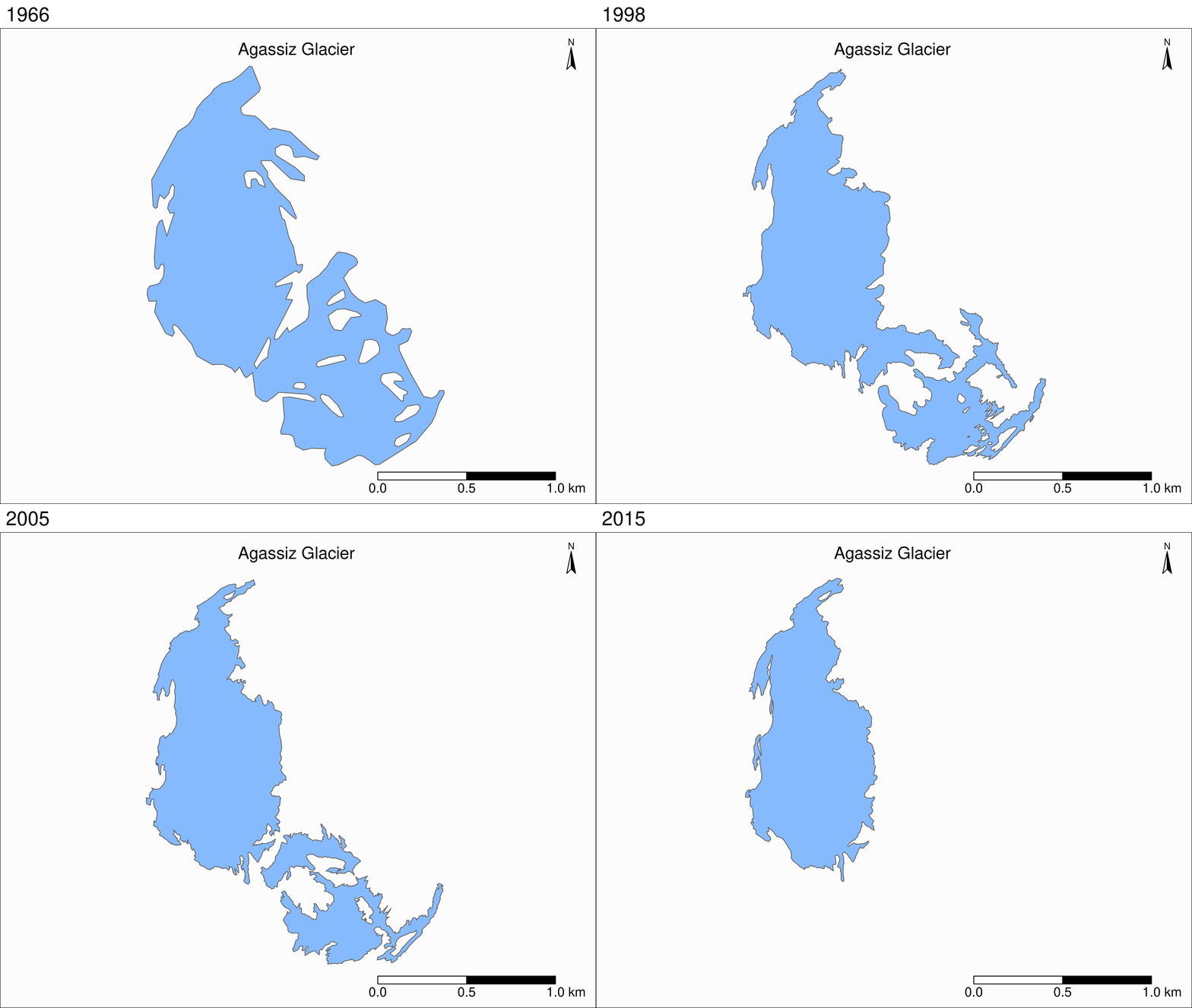
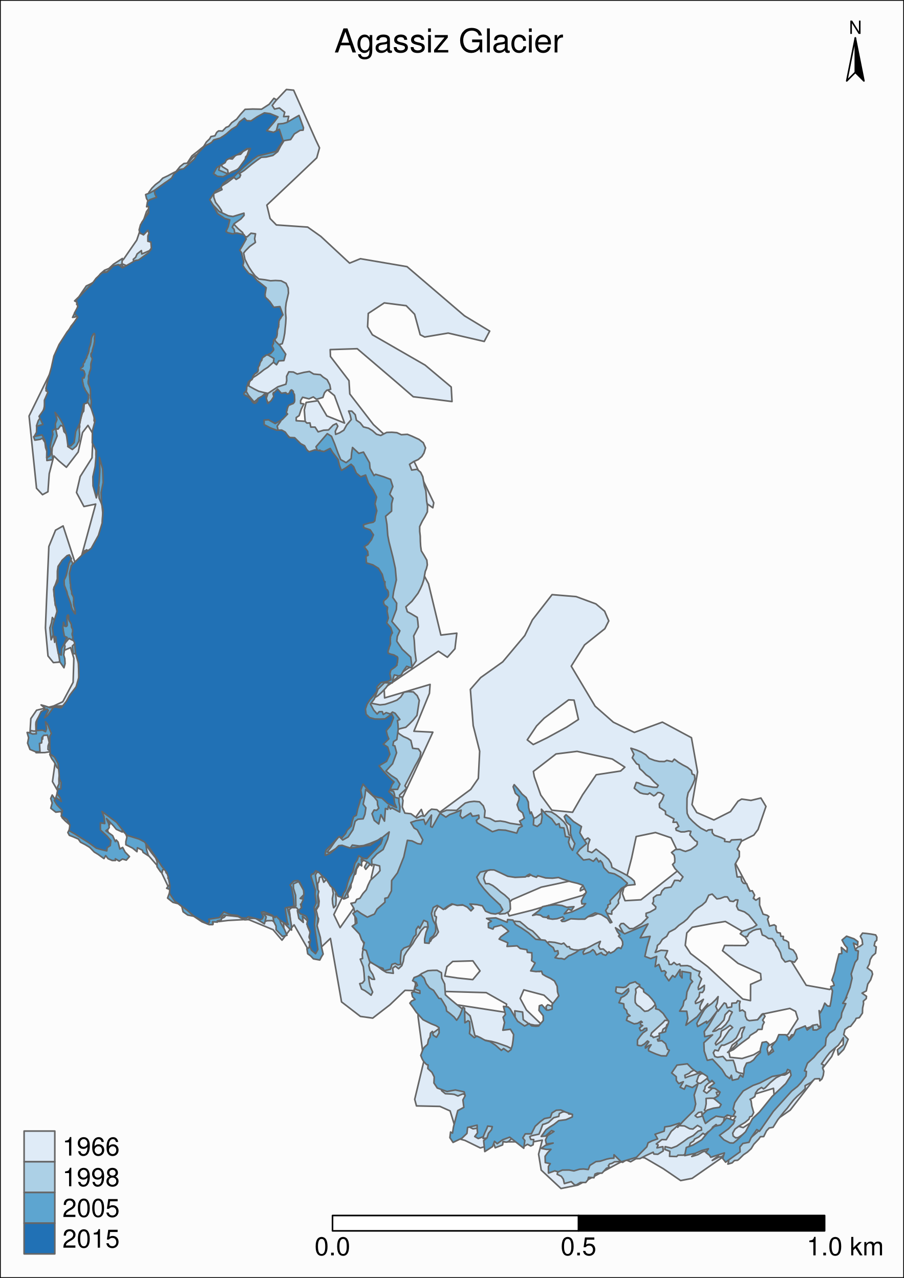
tm_shape(ag) +
  tm_polygons("year", palette = "Blues") +
  tm_layout(
    title = "Agassiz Glacier",
    title.position = c("center", "top"),
    legend.position = c("left", "bottom"),
    legend.title.color = "#fcfcfc",
    legend.text.size = 1,
    bg.color = "#fcfcfc",
    inner.margins = c(0.07, 0.03, 0.07, 0.03),
    outer.margins = 0
  ) +
  tm_compass(
    type = "arrow",
    position = c("right", "top"),
    text.size = 0.7
  ) +
  tm_scale_bar(
    breaks = c(0, 0.5, 1),
    position = c("right", "BOTTOM"),
    text.size = 1
  )
tmap_animation(tm_shape(ag) +
                 tm_polygons(col = "#86baff") +
                 tm_layout(
                   title = "Agassiz Glacier",
                   title.position = c("center", "top"),
                   legend.position = c("left", "bottom"),
                   legend.title.color = "#fcfcfc",
                   legend.text.size = 1,
                   bg.color = "#fcfcfc",
                   inner.margins = c(0.08, 0, 0.08, 0),
                   outer.margins = 0,
                   panel.label.bg.color = "#fcfcfc"
                 ) +
                 tm_compass(
                   type = "arrow",
                   position = c("right", "top"),
                   text.size = 0.7
                 ) +
                 tm_scale_bar(
                   breaks = c(0, 0.5, 1),
                   position = c("right", "BOTTOM"),
                   text.size = 1
                 ) +
                 tm_facets(
                   along = "year",
                   free.coords = F
                 )filename = "ag.gif",
               dpi = 300,
               inner.margins = c(0.08, 0, 0.08, 0),
               delay = 100